Report Designer
The Report Designer displays the following interface enabling to create your own custom report formats. Drag elements such as text boxes, picture boxes and lines from the Toolbox area into any of the bands. You can also select the Field List tab to display a list of available data fields and drag these into the bands. Configure the report elements by selecting the element and then making settings in the Property Grid tab. To generate the report, select the Run Report function.

Tool Ribbon
The tool ribbon displays along the top of the Report Editor and provides the following options:

| Setting | Description |
|---|---|
| Report Tools | Provides options to create reports and save changes to and update the reports. When creating a new report, the Create Report dialog displays letting you determine the where the report data is generated from. |
| Edit | Basic editing tools such as Copy, Cut and Paste. These options are also available from the right-click menu. |
| Font | Provides options to define font type, size, justification etc for the text added to the report template. |
| Alignment | This section provides alignment options to apply to the selected control on the report template. |
| Layout | Similar to the Alignment options, it allows you to determine the layout of the objects added to the report. |
| Zoom | Provides zoom options to the template. Note that these options are only for editing purposes in the report template only and do not carry over to the actual report. |
| View | Lets you toggle the display of the view windows of the Report Editor such as the Report Explorer, Property Grid, Tool Box etc. |
| Scripts | This option allows the very advanced users with coding experience to write specific scripting functions to customize the appearance of report controls, bands, or a report itself. |
Report Selector
On the left-hand side of the "Edit Report" dialog there should be both the "Report Selector" and the "Tool Box".

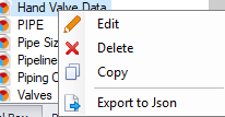
The Report Selector list the reports defined for the OpenPlant applications. This interface is also available from within the applications letting the user select which reports to run. Select a report to load it into the Editor for modification. Right clicking on a selected Report will show different options dealing with the edit process.
| Setting | Description |
|---|---|
| Edit | Displays the Edit Report dialog where you can modify the properties for the report. |
| Delete | Deletes the selected report from the list. |
| Copy | Creates a new report using the given report's report file for the new report. |
| Export to Json | This option exports the report to a Json file. |
Tool Box
The Tool Box option provides tools that can be placed onto the report file.

Two good examples are the "Table" and "Label" tools. Just dragging and dropping these tools onto the report design area will place those tools on it.

Once placed, these tools can be linked to data using the [>] button at their top right corner. Pressing this button will load a dialog similar to the one below (these dialogs may change depending on the tool that is being modified).

| Setting | Description |
|---|---|
| Text | The text to be displayed as the label. |
| Data Binding | Determines what data will be attached to this tool. This can be any field that is listed in the Field List. |
| Format String | This allows for string formatting. For example, if a value is a known currency such as [COST], then it can be set to the Currency of '$0.00'. This will show the value in that format. |
| Summary | This provide summaries, counts, and other operations that we can use to calculate data. For example, if we wanted to so a count of all components, then we can use the Sum option here. Click the Browse icon to open an editor where you can define a summary function. |
| Angle | Determines the Angle of the tool. |
| Anchor Vertically | Sets anchors so that the tool doesn't move when things are resized on the report. |
| Formatting Rules | This is like the format String. It just does this based on conditions that the data it is bound to meet. For example, if the data is a number it can format the string to a specific format. |
| Auto Width | Sets if the tool can automatically change width. |
| Can Grow | Sets if the tool can grow. |
| Can Shrink | Sets if the tool can shrink. |
| Multiline | Determines if the tool can have multiple lines or not. |
| Word Wrap | Determines if the tool can wrap its words when hitting the end of the tool's borders. |
Report Design Area
The central area of the interface where you place and arrange the elements of the report. Select the Designer tab at the bottom of this area when you are placing or editing report elements.
The report design area is divided into horizontal bands that represent different parts of the report page (header, body, footer, etc.).
Create the bands that will make up the main areas of the report page. Each band contains a title bar with the name of the band type. Each band can be collapsed by click the arrow icon to the left of the title in the title bar.
Group and Sort section
This section allows for grouping and sorting of data. When grouping, you select a field from the database/table that the report will use to group the rest of the data by. When sorting, the data is just ordered by the selected field. A group will automatically sort based on its values when created.
- Adding Group can be done by pressing the [Add a Group] button. This will bring up the field selection, once selected, it will then add the group to the list.
- Sort Order determines how to sort the values.
- Delete option will delete the selected tool.
- The Move Up/Move Down options move the selected tool up or down in the report.
Filter
Used to filter the data. It allows for special filters to be applied at run time of the report. For example, if a report needs to only show Linenumbers starting with L1** then that can be added here. It can also be used to exclude items as well. Toggling the [Apply] button will activate the filter while pressing the Clear will remove all the filter data show in the edit area.
- Press the plus symbol
- Select the column to filter on by pressing the blue text in the brackets [Column1]
- Change the value to filter by, by pressing the <enter a value> area
- Once done, press the Apply button to apply the filter to the report
- To see the changes, load the Print Preview with the filter on and then off

Report Explorer
The Report Explorer section provides a tree view of the items inside of the current report. It allows for quick selection of the different controls in the report. Any control that is added to the report will be listed here. You select the control just by clicking on it here and it will become highlighted in the report. This will also load the control into the Property Grid for more detailed editing. The Report Explorer also lists the headers, footers and bands along with the other general items added to the report.

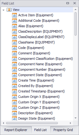
Field List
This is a list of all the available fields from the data. The classes that were selected in the Create Report process should appear as the top node while the properties for each class should show up under them. You can either assign the property to an existing label or tool from the Tool box detailed above or simply drag a field onto the Design Area. This will place a label that is linked to that field. The fields also show what type of data they are in the icons. There is also a field called Parameters but this is used when a report needs a value defined at run time of the report, such as a time stamp.
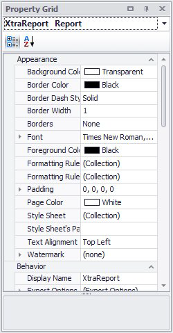
Property Grid
This area gives the properties for a selected Tool. These properties can be modified here. For example, if a label needs some padding, it can be set under the "Padding" property. Some properties use pull downs to have their data changes while others have text fields or special popup windows. Testing each one should show how they work. Most of the properties show a description in the bottom grey area of the dialog when they are selected.
The property grid is grouped in the following sections: